Documentation accompanying the “Stops and Charges in Oakland” visualization tool
(July, 2016: This note and the visualization it describes is based on a small, early data set provided by Lieutenant Chris Bolton. Subsequently Oakland Police Department provided complete data for 2015, and an updated description and visualization are now available.)
Background
A key question facing citizens and police in many cities is how racial profiling may influence discretionary stops. One way to evaluate the distribution of stops, across an entire city and especially as smaller, racially diverse neighborhoods are considered, is to compare the rate of stops to the number of times they actually lead to charges of crimes. For example, if a stop winds up finding an unlawful gun, or evidence of a robbery or burglary, it can be considered especially worthwhile.
As part of his March, 2016 report for the Office of the Inspector General (OIG) within the Oakland Police Department, Lieutenant Chris Bolton organized a short-term data collection effort for the period Dec 1-15, 2015. Lt. Bolton provided the data to me for additional analysis, because “… OIG has initiated active partnerships with community members supportive of open data and use, with the goal of providing as much data as possible in relation to further projects.”
In the text below, I’ve capitalized all references to any specific “race/ethnicity” (Black, White, etc.) as these terms have been used in Lt. Bolton’s data. (My reasons for doing so are similar to those considered by Merrill Perlman.) Beyond this syntactic fix, I worry that serious issues may arise in further discussions of this data, because these superficial word tokens confound very different contexts when they are used as part of the various OPD departmental communications (daily bulletins, weekly reports, communication orders, etc.). These issues are not addressed here.
Lt. Bolton collected data of two sorts during this period:
CHARGES: Focusing on incident reports involving major criminal statutes (robbery, felony assault, shooting, rape, assault to commit rape, and burglary) identified 508 incident reports during this period. 167 of these identified reports contained suspect descriptions by race, involving 180 individual suspects (some charges involved multiple suspects). The case id (CID), date and beat associated with this charge were also provided.
STOPS: During this same period, a total number of 1792 persons were discretionarily contacted or detained by officers. The race of the person as well as the date and beat associated with this stop were also collected. A distinct stopID numbering system is used as a unique identifier for stop reports, and no correspondence between stopIDs and CIDs was made available.
A summary of these statistics, aggregated across all Oakland, is shown in Figure 1.
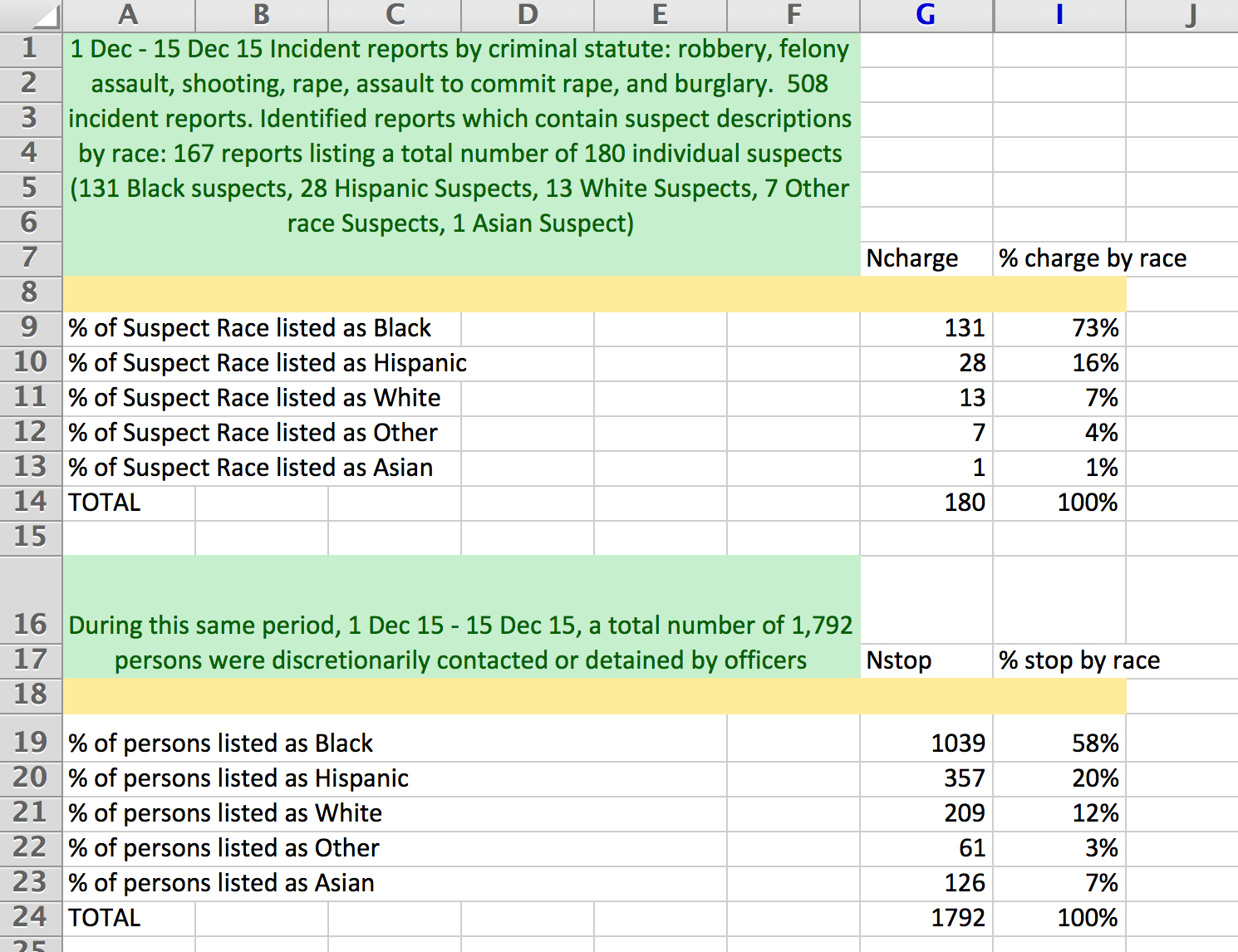
Figure 1
Visualization tool (click to view)
This interface distributes the two sets of STOP and CHARGE data across the 59 geographic beats.
The interface begins with radio buttons specifying whether STOP data statistics or CHARGE data statistics are to be displayed; see Figure 2.
![]()
Figure 2
(A third data set can also displayed, the difference between these two; further details below). Moving the mouse over any beat and “hovering” shows the beat name and the total number of stops or charges for this beat, depending on which type of data has been selected.
Next are a series of sliders associated with each of the racial groups. It is initialized to include all races’ data. By sliding each of these sliders left or right, the proportion of this demographic group relative to others is increased or decreased. This allows various combinations of racial compositions to be considered. To simplify the examples below, we will focus first on exclusively Hispanic stops, then on Black charges. We do so by first pushing the Hispanic slider all the way to the right, and all others to the left, as shown in Figure 3.

Figure 3
The values displayed are the racially-normalized fractions within each beat. (Two regions are uncolored, corresponding to Lake Merritt and the City of Piedmont.) For example, beat 26X recorded a total of 35 stops, and 25 of these were of Hispanics. The fraction of stops that were of Hispanics in beat 26X is therefore 71%, and the beat is colored quite blue in Figure 4, consistent with the legend.
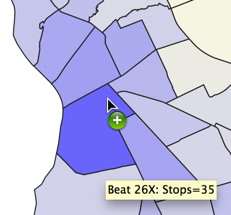
Figure 4
As a second example, considering CHARGES within the same beat 26X, there were a total of seven charges. Changing the sliders to focus on Blacks, two of the seven were of Blacks, the ratio is 29% which generates a lighter blue color, shown in Figure 5.
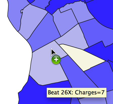
Figure 5
Because a key question involves the relation between stops and charges, a third quantity can also be displayed: the difference between (the racially-normalized fraction of) stops and (the racially-normalized fraction of) charges. This generates a number between -1 and +1, and a different color scheme is used for this range. Positive values imply there were more (normalized) stops than (normalized) charges, and negative numbers that there were more charges than stops; yellow implies they are nearly eqaul. Figure 6 uses 18X as an example.
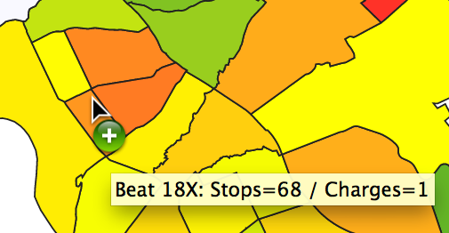
Figure 6
18X is orange because there were a total of 68 stops, 33 were of Blacks, (stop ratio=0.49), there was just one charge, it was of a Black person (charge ratio =1.0), the difference
0.49 – 1.0 = -0.51.
Conclusions
Despite the fact that this data comes from only a brief, two week period, it seems clear that beneath the simple summary statistics across all of Oakland given in Figure 1 above, there are rich variations when smaller communities are considered. For example, the geographically adjacent beats 14Y, 15X, 16X and 16Y seem to show considerably more stops of Blacks relative to the number of times Blacks were charged.
However, the small amount of data collected is insufficient to identify statistically reliable variations across beats. For example, in two of the beats just mentioned (14Y, 16X) there were not any charges reported, of any race. Another issue is that the number of stops varies dramatically across the beats, while the number of charges do not. This is shown in Figure 7.
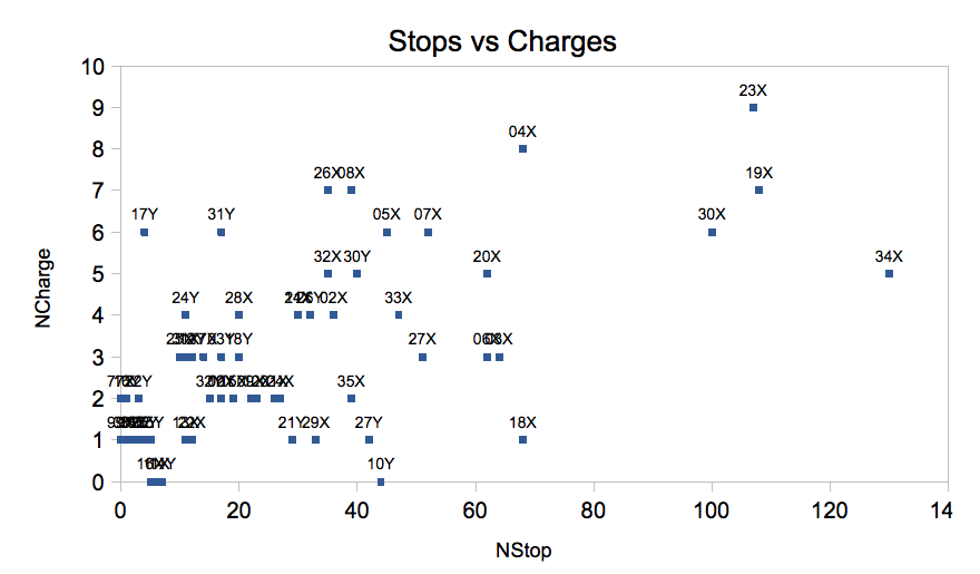
Figure 7
Beats 34X, 23X, 19X, and 30X in particular generated many more stops than others; Lt. Bolton reports that this was due to specific directives by OPD administrators in effect during this period in these areas.
Lt. Bolton’s initiative in attempting this analysis, and then making it available to the public, is to be commended. We can hope that as more complete record keeping (e.g., identifying suspect race in incident reports automatically, rather than the manual review
by Lt. Bolton required for this data set) over longer time periods, and refined to even smaller geographic regions (e.g. census tracts) would help all Oakland citizens understand policing of the city and their neighborhood that much better.
Technical details
Lt. Bolton’s final report talks of 35 beats, vs. the 59 reported here. He describes the difference: “57 Community Police Beats [were] collapsed into 35 Police Beats (no Xs or Ys) …. the extra beats you have are mistakes. I think I either cleaned those by inserting the right beat based on address or through it out if we were unable to determine.”
The original data provided by Lt. Bolton, the JSON version of the data loaded to the browser, the GEOJSON regions used for OPD beats, and the d3-based javacript that animates the visualization are all available on github.